UX Blog
The Mitsue-Links UX Blog shares some of our insights and opinions about UX in Japan, experience design and cultural differences between user research in Japan and the world.
If you want to find out more about us, please contact us at uxa-japan@mitsue.co.jp
March 7, 2014
Why do you need to localize for Japan?
Here at Mitsue-Links, one of our specialist services is offering advice on website localization for the Japanese market. However, it is still quite surprising the number of times I am asked by potential clients - "Why should we localize our site for Japan?"
Usually the client already has a global website template for use across various markets. The site already works well in other countries in terms of usability and the copy was translated professionally. So, why would clients need to make an exception for Japan?
Firstly, let's look at some numbers. Japan has a population of around 127 million. Within that, there are 102 million internet users; giving an internet penetration rate of around 80%. That is a very big internet market, in fact Japan is the 4th largest internet using country in the world.
With such a large potential market, it would be best to make sure all content is as suitable and as easy to use as possible for the local market. To add to the case, Japanese users are also extremely cautious when it comes to using what are seen as "non-Japanese" sites. It all comes down to Japanese users needing to trust a website.
In our research experience, Japanese users consistently place more value on trust
over other main factors which clients think are important - such as design, usability or even prices of products etc. Without trust, Japanese users will not even use the website, let alone purchase products by entering their private data and payment details.
So what are the things that may give feelings of unease or decrease trust for Japanese users?
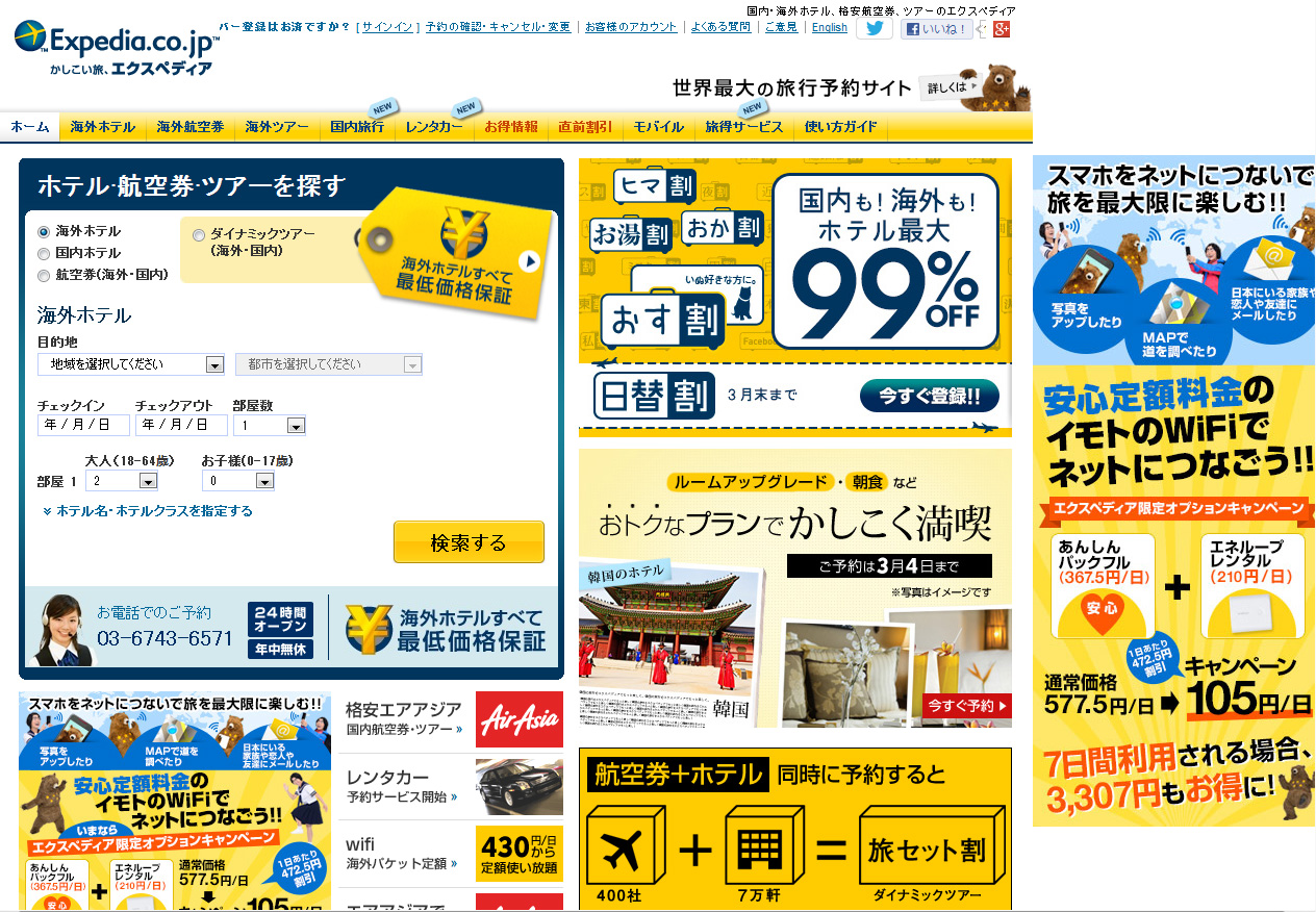
Obviously, badly translated text or even incorrect tone of voice in the copy will instantly give Japanese users a feeling that a site was originally non-Japanese. Also, design is a big give-away.Furthermore, design is very important in generating a feeling of trust - for example, whether the design resembles a typical Japanese site (bright, colourful, and crammed full of information.
Of course that is an over simplified view, but nonetheless true. Getting a site localized properly for the Japanese market, to make it look and feel Japanese, will not only increase your chances of successfully entering the market but, even more importantly, it will stop you losing potential and future customers - through giving bad impressions, inviting negative reviews or generating feelings of untrustworthiness. No matter how usable or well-designed your site may be; if ultimately users will hesitate in registering their details or inputting payment information, then all previous hard work may have been wasted.
Localization or localization testing will not only save you time and trouble down the line, but ultimately save you money.
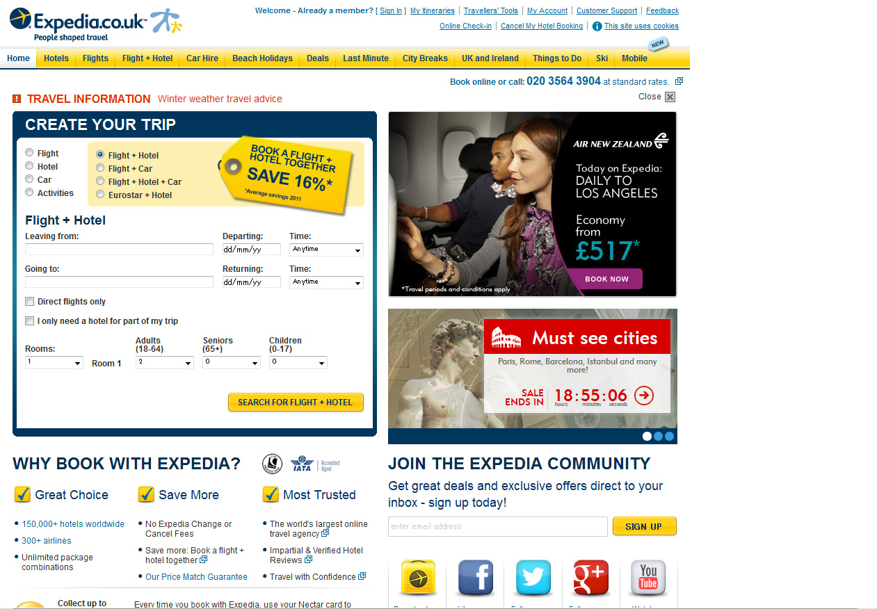
- Global template site example

- Image is from Expedia.co.uk. The same template is used throughout most Expedia markets.
- Localized site example

- Image is from Expedia.co.jp. The localized Japanese site has a bear. Japan only.
